Customizing Components
Often you may want to bring your own custom look to a component in Dara framework. In this section you will explore the different ways in which this can be achieved with Dara.
There are three ways in which components can be customized:
Default Customization
This method is the simplest and should account for most of the cases in which you need to change the styling of components. These are properties which all Dara components inherit, you can pass them to the component as you would with any other property. You can find full list of properties here.
Example:
Card(
    Text('My bold and italic text in a blue card', bold=True, italic=True),
    background='powderblue',
)
Passing Custom CSS
Components in Dara have a property called raw_css which allows you to pass CSS properties as a dict or string.
For example the above example could also be written as:
Card(
    Text(
        'My bold and italic text in a box with blue background',
        raw_css={'font-weight': 'bold', 'font-style': 'italic'}
    ),
    raw_css={'background-color': 'powderblue'}
)
The advantage of this method over the previous is that you can pass any CSS property as you are not limited to the default ones. This freedom allows for further customization. For example, if you wish to add a border with 1px thickness to the Card you can do so by passing the border property to the raw_css property of the card.
Card(
    Text(
        'My bold and italic text in a box with blue background and solid border',
        raw_css={'font-weight': 'bold', 'font-style': 'italic'}
    ),
    raw_css={
        'background-color': 'powderblue',
        'border': '1px solid #111'
    }
)
Below is an example of how it can be used to customize a component.
Common CSS Properties
Below you will see some commonly used CSS Properties. These properties are measured with different units. It is helpful to know that CSS measures length in two different ways.
Absolute
Absolute lengths take on a fixed length. Absolute lengths should be in pixel units (px).
Relative
Relative lengths take on a length relative to another length property. For example, relative units can be relative to the font-size of the element (em) or relative to the parent element (%).
You can learn more about CSS units here.
Properties
Text Color
The most common ways to set the color property are the following:
- Hex Values:
{'color': '#000000'} - RGB:
{'color': 'rgb(0, 0, 0)'} - Named colors:
{'color': 'red'}
Font Size
The most common ways to set the font-size property are the following:
- Absolute length:
{'font-size': '24px'} - Relative length:
{'font-size': '1em'}
Background Color
The most common ways to set the background-color property are the following:
- Hex Values:
{'background-color': '#000000'} - RGB:
{'background-color': 'rgb(0, 0, 0)'} - Named colors:
{'background-color': 'red'}
Height and Width
The most common ways to set the height and width property are the following:
- Absolute length:
{'height': '300px', 'width': '440px'} - Relative length:
{'height': '90%', 'width': '50%'}
height and width can also be set with a percentage of the window width and height with the properties vh and vw respectively. These also use percentages.
Border
The border-style property can take many values but below are a few examples:
- dotted:
{'border-style': 'dotted'} - dashed:
{'border-style': 'dashed'} - solid:
{'border-style': 'solid'} - double:
{'border-style': 'double'}
The most common ways to set the border-width property are the following:
- Absolute length:
{'border-width': '5px'} - Relative length:
{'border-width': '1rem'}
The most common ways to set the border-color property are the following:
- Hex Values:
{'border-color': '#000000'} - RGB:
{'border-color': 'rgb(0, 0, 0)'} - Named colors:
{'border-color': 'red'}
The most common way to set the border-radius property is the following:
- Absolute length:
{'border-radius': '5px'}
Padding
Padding is the transparent space in-between the border and content of an HTML element. Since each element can be thought of as a box, you can set the padding on all four sides of the box.
The padding-top, padding-right, padding-bottom, and padding-left properties can take the following types values:
- Length (px, em, etc.):
{'padding-top': '3px', 'padding-right': '3px', 'padding-bottom': '3px', 'padding-left': '3px'} - Percentage:
{'padding-top': '5%', 'padding-right': '5%', 'padding-bottom': '5%', 'padding-left': '5%'}
Margin
Margin is the transparent space between the border and other HTML elements. Since each element can be thought of as a box, you can set the margin on all four sides of the box.
The margin-top, margin-right, margin-bottom, and margin-left properties can take the following types of values:
- Length (px, em, etc.):
{'margin-top': '3px', 'margin-right': '3px', 'margin-bottom': '3px', 'margin-left': '3px'} - Percentage:
{'margin-top': '5%', 'margin-right': '5%', 'margin-bottom': '5%', 'margin-left': '5%'}
Border, padding, and margin are all a part of the HTML box model which you can learn more about here.
Many properties in CSS can use shorthand.
Example 1: {'margin-top': '3px', 'margin-right': '3px', 'margin-bottom': '3px', 'margin-left': '3px'} can be specified simply as {'margin': '3px 3px 3px 3px'}
Example 2: {'border-width': '5px', 'border-style': 'dotted', 'border-color': 'red'} can be specified simply as {'border': '5px dotted red'}
This is just a brief overview of some CSS properties. To learn more about CSS, check out the MDN Web Docs.
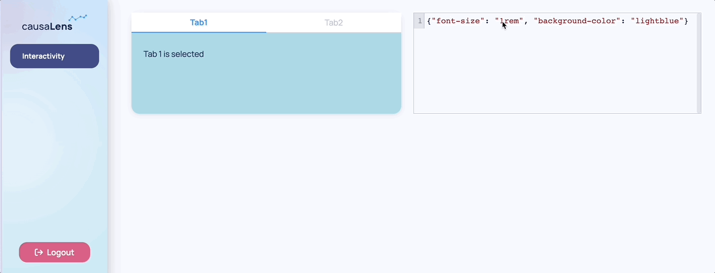
Both of the methods discussed so far have a limitation. They only affect the style property of the parent HTML element. This means that you might not see the change you would initially expect.
In this next example the background-color property is changed for both TabbedCard component, however the tabs themselves did not change color. That is due to specificity, the tabs have their color set and as a child that is more specific than the color set to the parent. What this means is that if a parent had some CSS property defined, e.g. color to be red, and then a child has color blue, then blue takes priority over red because it relates to a smaller unit, it is more specific. Components that are deeply nested may have certain styles overwritten, and in that case to see a color change you would need to target them directly.
Another limitation is that you can't control some states such as hover as you can't target those states through the style property.
For these cases there is a third method in which you can pass a CSS string to the raw_css property. This is covered in the next section.
Targeting Child Components
This last method is the most powerful in achieving maximum customization however it does require CSS knowledge. It allows a user to pass CSS as a string to a component.
Looking at the same components in the previous section, you can see how by using this new method you can change the background color of the TabbedCard tabs. It also allows for some more useful CSS properties to be added such as defining what happens on hover.
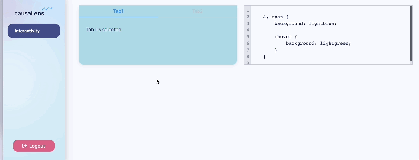
And this is the code which generated the example above:
from dara.core import ConfigurationBuilder, Variable, py_component
from dara.components import Text, Stack, ComponentInstance, TabbedCard, Tab, CodeEditor

css_string = Variable(
    """
    &, span {
        background: lightblue;

        :hover {
            background: lightgreen;
        }
    }
"""
)

@py_component
def tab_component(code: str):
    return TabbedCard(
        Tab(Text('Tab 1 is selected'), title='Tab1'),
        Tab(Text('Tab 2 is selected'), title='Tab2'),
        height='200px',
        raw_css=code,
    )

def page_content() -> ComponentInstance:
    return Stack(
        tab_component(css_string),
        CodeEditor(script=css_string, width='50%', height='100%'),
        height='200px',
        direction='horizontal',
    )

config = ConfigurationBuilder()
config.add_page(name='Interactivity', content=page_content())
To use this feature, a knowledge of CSS Selectors is required. When you want to change a component, an easy way would be to use the browser's inspection tool. On Chrome this can be done by right clicking the page and selecting "Inspect". You can then explore the hierarchy in which the components are built on the page and figure out what you need to target.
You may have noticed the example above contains some non-standard CSS features. This is because Dara uses styled-components under the hood which supports a few extra features on top of standard CSS you can take advantage of, such as nesting.
Another useful resource to use when dealing with styling is Visbug Chrome Extension. This extension comes with a lot of tools to change the look of your page which allows you to play with the look in real time without having to jump back and forth to the code for each change.
Seeing how much you can customize and build your own components, it helps to define them as functions or classes so you can repeatedly call them with different inputs instead of having to redefine and customize the component again. Check out the section Best Practices: Reusing Components to learn more.
Id and For properties
Any components which inherit the ComponentInstance class can have an id_ and/or for_ property.
These properties have no runtime effect and are intended to help identify components with human-readable names in the serialized trees, not in the DOM
from dara.core import Text, Input, Stack

Stack(
    Text('This is a label', for_='my_input'),
    Input(placeholder='This is an input', id_='my_input')
)
The serialized component tree will now have the for_ and id_ properties for the respective components