Introduction
In the previous blog post of the series you learned how to go from an idea to a wire frame of an app. Now it is time to take it into the next step, if you already have an initial design or existing app what are things to look out for and make it better? Here you will cover some simple tips and tricks to make your apps more user friendly. To “wow” the user with a seamless and intuitive experience with only a few basic principles kept in mind.
Design principles that you can relate
There are numerous design principles such as Neilsen’s 10 design heuristics, Schneiderman’s 8 golden rules and Norman’s design principle but not every principle is relevant to applications that aim to showcase the models that are heavy on data visualisation. Instead of going through all the principles and rules, this blog post will introduce you to the juicy ones that you can apply to your own app right away to impress the user with stellar design.
A good design is consistent
Good design should always be consistent,
And so you must be persistent,
To create a userflow that's easy to pursue,
Within a layout that will sure shine through.
Consistency is the key to good design. For example, most web pages that have a search bar place it at the top of the page. As a user even without thinking, if you want to search for something that is where your eyes will go to. Now imagine a website that has it at the bottom, for some people it might not make a difference, but many will likely miss it. Users don't want to work hard to use an app, it should "just work" for them.
Consistency must also hold true within your work. Another example: you have multiple modals, pop-ups that require user input, with submit buttons. If they are often changing between the right side and left side, and/or changing colours. This will likely lead to misclicks, how often do you really read a button rather than just skim read it? Keeping it consistent will reinforce what the user expects, and so avoid unnecessary frustration.
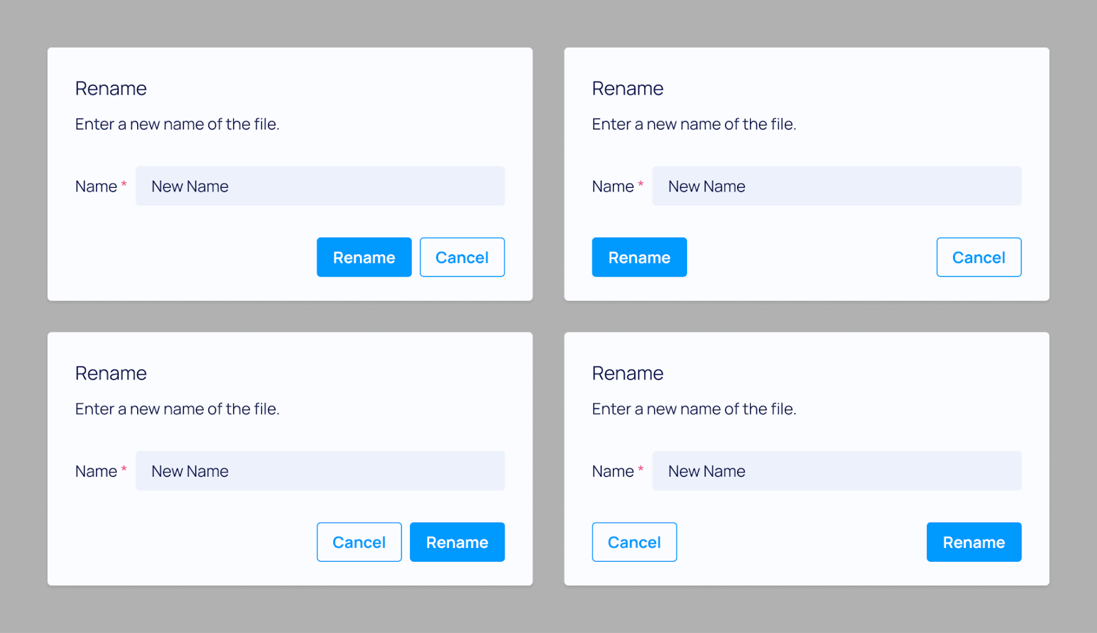
Using a certain hue of red for errors, and a certain font size for important information, these consistencies can be immensely powerful in helping you to tell the right story, bringing their attention to key facts and actions.
A good design follows visual hierarchy
Visual hierarchy is a powerful tool to guide the user to focus on important contents thus reducing the cognitive load and enhancing the user experience. There are several principles regarding visual hierarchy but the most relevant ones are about location, space, colour and size.
Firstly, location effectively indicates the structure of an interface. Specifically, areas divided by lines of the same direction - either vertical or horizontal - imply that they are highly related to each other. Therefore, if several items are highly relevant to each other, they should be laid in parallel.
Additionally, within the same hierarchical level, important or foremost contents should be placed on top and/or left. This is because most human eyes move from top to bottom and left to right as they are used to reading in the same trajectory. (This, in other words, might not be true in different script cultures such as Arabic.) Therefore, it is natural to position input on the left and output on the right and summary on the left and explanation on the right. By locating the contents appropriately, it becomes much easier to perceive the necessary information thus enhancing the delivery of the information.
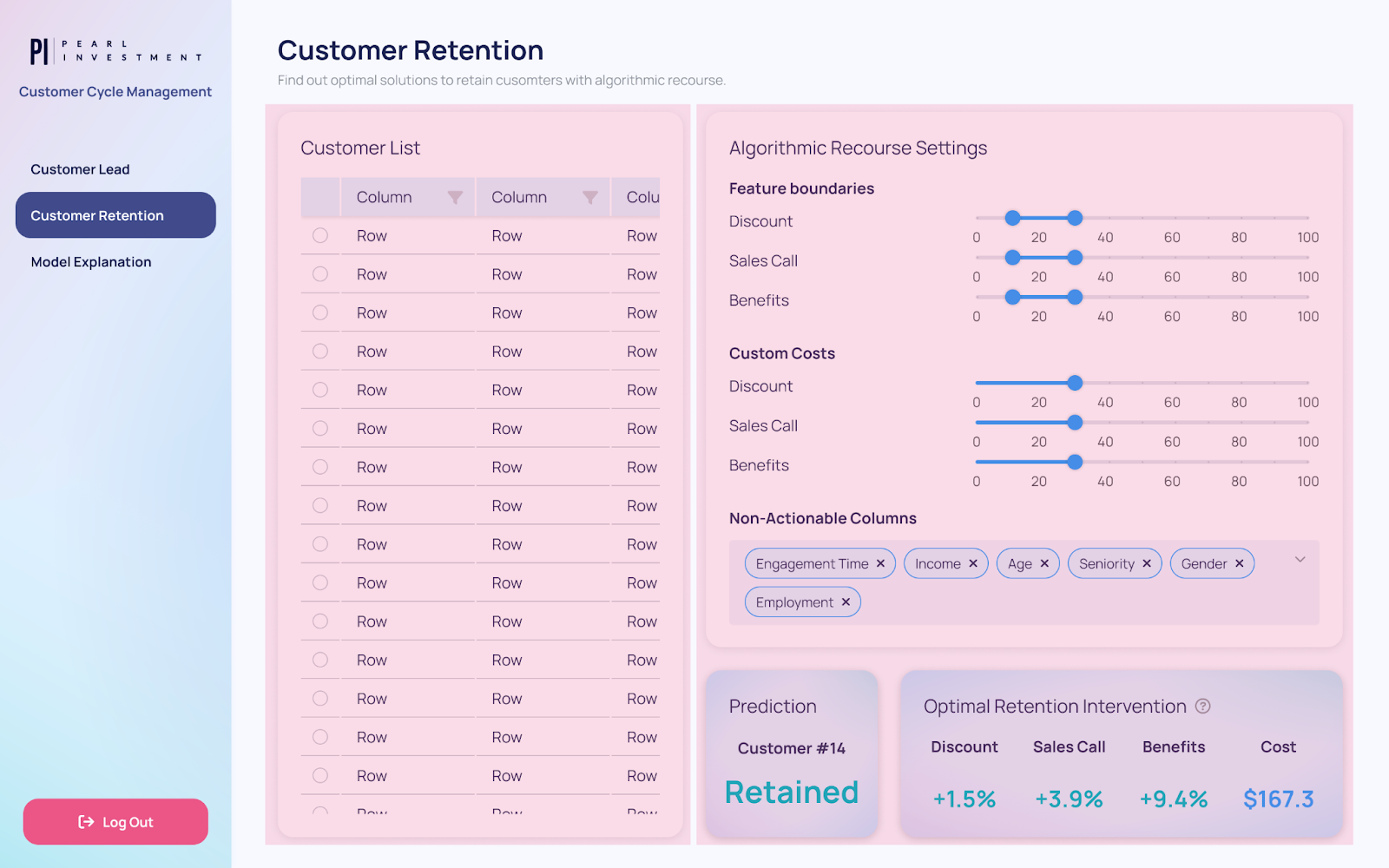
[Not good] The page is split into 2 vertical areas with incoherent criteria.
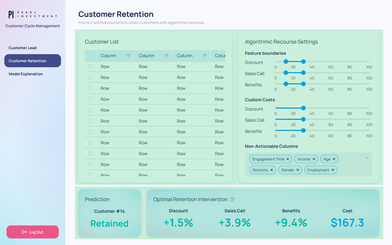
[Good] The page is split into 2 horizontal areas, from input to output.
Secondly, proximity is a very strong visual channel to indicate relevance. If elements are close to each other, it means they are more relevant and vice versa. For example, inputs with different functionalities are better presented in clusters by having more space between them. Clustering signposts to the user that they are now entering a different area, thus reducing the mental burden to identify the purpose of the given interface.
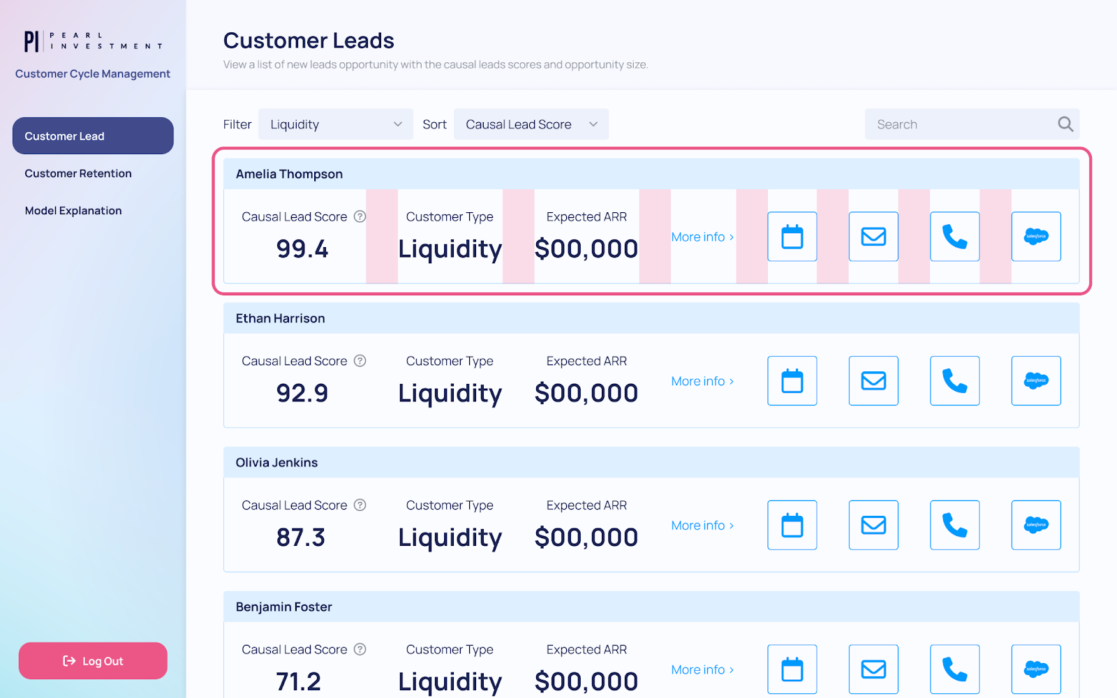
[Not good] All the items have gaps of the same size.
[Good] Items are grouped into two relevant clusters with a larger gap in between.
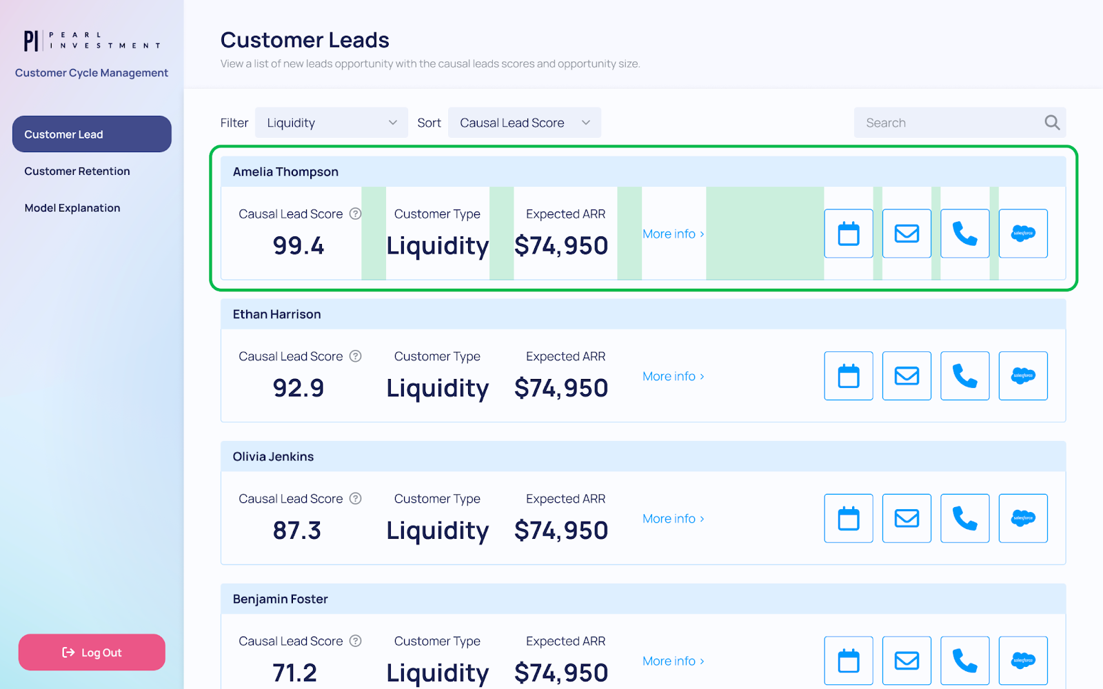
Lastly, it is beneficial to utilise various styles, such as colour, size and shape, to draw the user’s attention to significant information. Colour can create focal points easily while implying functionalities with universal connotations. For example, while dark or almost black colours imply plainness, certain colours emit a specific impression like below:
| Colour | Impression | Function |
|---|---|---|
| Blue | Neutral but important | Information |
| Green | Positive | Success |
| Yellow | Somewhat negative | Warning |
| Red | Negative | Danger, Error, Failure |
In Dara we provide in the theme default colours that can be used for each of these cases, these also include considerations for colour blindness.
In addition, different styles and sizes, especially for texts such as bold, italic and underline, can signify importance apart from other components.
The caveat is, however, that different styles should not be overused in terms of both the number and frequency. When there are more than five colours present, the colour loses its significance and no longer works as an emphasis. Even with a limited set of colours, if it covers more than half of the interface, it does not provide enough strength to the focal point. Likewise, having too many different styles deters consistency and distracts the user from focusing on the crucial information.
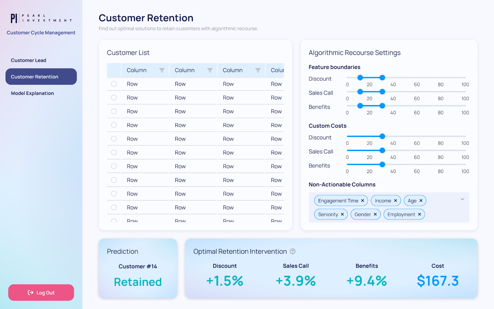
[With good design it is possible to achieve effective colour highlighting even with a limited palette]
Do I have too much?
A common mistake is to try and pack too much in a page, too many inputs, too many graphs. This can be overwhelming and confusing. Although you might be adding more information, in practice the user is less able to digest and understand what is important.
Some common signs that this may be an issue are:
- Having to adjust the font size to be smaller than default.
- Having to often remove paddings and margins in order to fit components.
- Using tooltips rather than text everywhere to explain functionality.
- Avoiding adding text explaining the context because that will mean other components don't fit.
If there is too much on a page, there is no focus, and users may feel frustrated and simply not able to achieve all the cool things you planned. Make sure the purpose of the page is clear, and to offload where necessary by adding different pages, modals, forms etc.
Do I have too little?
Another common issue is apps that don't have enough context. A random person should be able to look at any page of an app and have a general idea of what it is trying to show and what they can do in it. Of course a data scientist might have a much more in depth understanding of what a certain table is showing than a business user. However both should still be able to understand what that page's purpose is.
- Do you explain what plots and tables are attempting to show?
- Do you clearly explain what inputs are required from the user?
- Is there any more context that is needed in an area for a user to understand how to use it?
Make sure your design has space to add both text and tooltips as appropriate, so that your app is self-sufficient. A user ideally should not need a tutorial to understand how to use an app!
Choosing the right components
Although multiple components could be used to achieve the same purpose, each component comes with its own set of conventions so understanding these can help you to choose the right component for the job and reduce friction with the user.
For example, suppose you have a list of items and you want the user to choose between them. There are a number of components that could be used here, to name a few you could use radio buttons (RadioGroup), checkboxes (CheckboxGroup) or a select dropdown (Select).


If you can only have one item selected at a time that would require either radio buttons (RadioGroup) or a simple select dropdown (Select). However if multiple items could be chosen, that would be checkboxes (CheckboxGroup) or a multi-select dropdown (Select with multi=True flag).
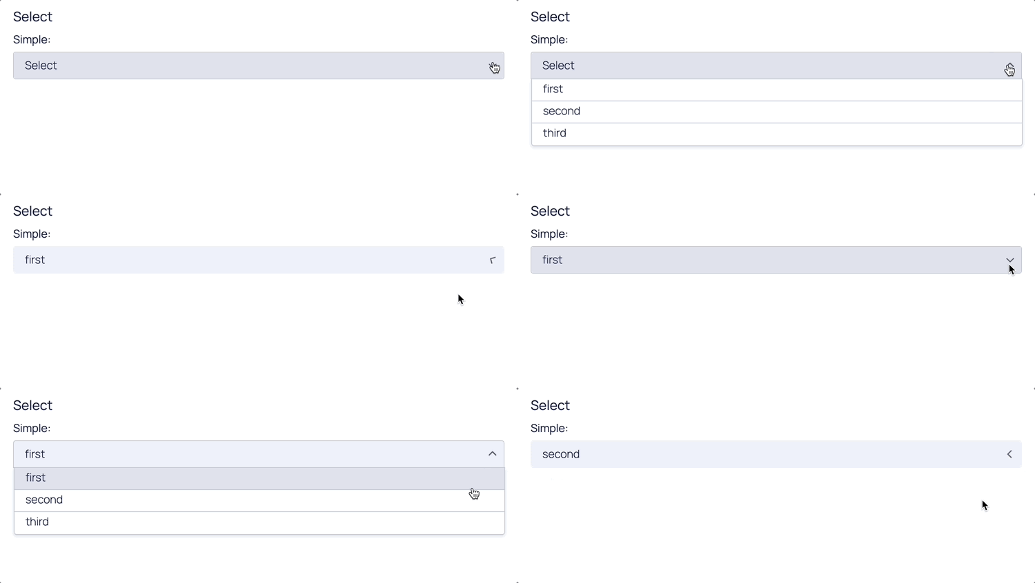
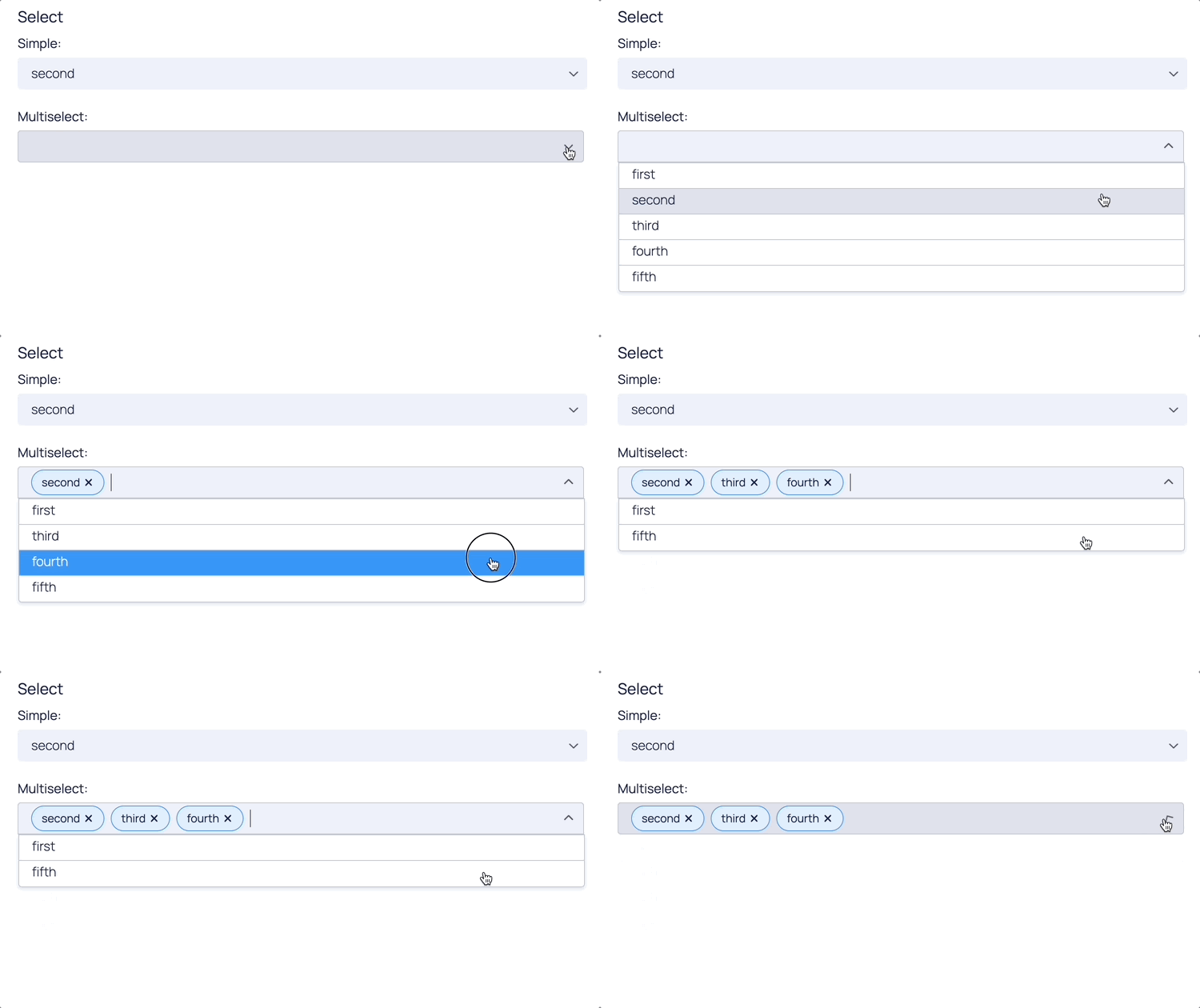
When choosing the right component, context is always key. RadioGroup and CheckboxGroup show all of the available selections, these are often more appropriate for forms because you need to see the options at once to make your decision. However Select is more compact, and if the user doesn't need all the options immediately visible, using the Select component could be the way to go.
And if the choice involves images or graphs then maybe what you need is ComponentSelectList!

Conclusion
This blog post covered major design principles including consistency, visual hierarchy, appropriate amount of information and following the convention. In spite of simplicity, they are highly effective in boosting both the user experience and user interface, and make your life as an app creator much easier.
What is important to bear in mind is that design is a language with its own rules, and depending on how you string the words together, it can be easy or hard to understand. With these tips, we hope to have provided you with some of the 'grammar' to improve the way you communicate through apps.

