radio_group
RadioGroup
from dara.components.common.radio_group import RadioGroup

class RadioGroup(FormComponent)
RadioGroup component accepts list of selectable items and allows user to have one of them selected at a time.
Simple RadioGroup component:
from dara.core import Variable
from dara.components import RadioGroup, RadioItem, Text

value_var_str = Variable('first')

# you can pass items as a list of values
RadioGroup(
    items=['first', 'second'],
    value=value_var_str,
)

value_var_num = Variable(1)

# or as an `RadioItem` list
RadioGroup(
    items=[RadioItem(label='first',value=1), Item(label='second',value=2)],
    value=value_var_num,
)

# or as an `RadioItem` list with arbitrary components
RadioGroup(
    items=[
        RadioItem(label=Text(text='first', color='red'), value=1),
        RadioItem(label=Text(text='second', color='blue'), value=2)
    ],
    value=value_var_num,
)
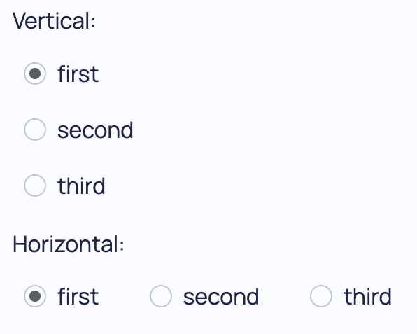
This component can also be displayed horizontally by setting the direction param:
from dara.components.common import RadioGroup, Item

RadioGroup(
    items=['first', 'second'],
    value=value_var_str,
    direction='horizontal'
)
Arguments:
items: An Item list that defines labels to render and values to receive from RadioGroupvalue: A Variable instance recording the component's initial and subsequent statelist_styling: If set to True, the component shows a list style version of radio group where the background is highlighted instead of the radio button themselves.onchange: Action triggered when the selected value has changed.direction: Sets the direction of the radio buttons can be either horizontal or vertical.id: the key to be used if this component is within a form
Attributes
- items: Union[List[RadioItem], List[str], NonDataVariable]
- value: Optional[Union[Variable[Any], UrlVariable[Any]]]
- list_styling: Optional[bool]
- onchange: Optional[Action]
- direction: Direction
- id: Optional[str]