button_bar
ButtonBar
from dara.components.common.button_bar import ButtonBar

class ButtonBar(FormComponent)
The ButtonBar component adds a button bar with a set of options that can be selected from and update a Variable instance. It can be a useful component for defining different content to be displayed, similar to that of a navigation bar.
A simple button bar component:
from dara.core import Variable
from dara.components.common import ButtonBar, Item

bar_var = Variable('val2')

ButtonBar(
    items=[
        Item(label='Value 1', value='val1'),
        Item(label='Value 2', value='val2'),
        Item(label='Value 3', value='val3'),
    ],
    value=bar_var,
)
A ButtonBar component with onchange:
from dara.core import Variable, action
from dara.components.common import ButtonBar, Item

bar_var = Variable('val2')

@action
async def notify_change(ctx: action.Ctx):
    bar = ctx.input
    await ctx.notify(title='Alert', message=f'ButtonBar value changed to {bar}', status='SUCCESS')

ButtonBar(
    items=[
        Item(label='Value 1', value='val1'),
        Item(label='Value 2', value='val2'),
        Item(label='Value 3', value='val3'),
    ],
    value=bar_var,
    onchange=notify_change(),
)
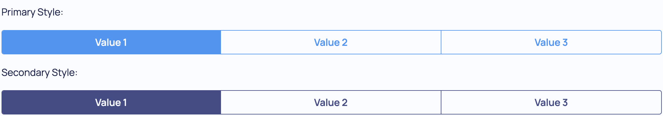
A button bar component with styling:
from dara.core import Variable
from dara.components.common import ButtonBar, ButtonBarStyle, Item

bar_var = Variable('val2')

ButtonBar(
    items=[
        Item(label='Value 1', value='val1'),
        Item(label='Value 2', value='val2'),
        Item(label='Value 3', value='val3'),
    ],
    value=bar_var,
    styling=ButtonBarStyle.SECONDARY
)
Arguments:
items: An Item list that defines the button labelsvalue: A Variable or DervivedVariable updated by the buttonsonchange: Action triggered when button in ButtonBar is selectedid: the key to be used if this component is within a formstyling: A style of the ButtonBar, can be 'primary' or 'secondary'
Attributes
- items: List[Item]
- value: Optional[Union[Variable, UrlVariable]]
- onchange: Optional[Action]
- id: Optional[str]
- styling: ButtonBarStyle