tooltip
Tooltip
from dara.components.common.tooltip import Tooltip

class Tooltip(ModifierComponent)
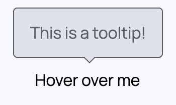
A Tooltip Component that allows for a tooltip to be attached to any other component in the framework. It accepts any component as it's first parameter and this will be the component that the tooltip is attached to. The second parameter can be either a string or a component and will be rendered as the content of the tooltip. The last parameter can be used to adjust the placement of the tooltip. Available placements are: auto, top, bottom, left and right.
Note: Tooltip requires a single child, so any children you pass in will implicitly be wrapped in a Stack element.
You can also use the component directly in order to apply styles to it.
A Tooltip component can be added via:
from dara.components.common import Tooltip, Input

Tooltip(
    Input(value=Variable('initial input value')),
    content='This is my tooltip',
    placement='bottom',
)
Using multiple elements
from dara.components.common import Tooltip, Text, Stack

Tooltip(
    Text('Hover me!'),
    Text('Hover me too!'),
    content='This is my tooltip'
)

# Or explicitly style
Tooltip(
    Stack(
        Text('Hover me!'),
        Text('Hover me too!'),
        hug=True
    ),
    content='This is my tooltip'
)
Arguments:
content: The text or component for the tooltip to displayplacement: Allows the placement to be specified, can be auto, top, left, right or bottomstyling: Defines the style of the tooltip, can be 'default' or 'error'
Attributes
- content: Union[str, ComponentInstance, Variable[str], DerivedVariable[str]]
- placement: str
- styling: str