select
ListSection
from dara.components.common.select import ListSection

class ListSection(BaseModel)
A class for building lists, takes a header and a list of Item objects to display.
Arguments:
label: The header to render for this sectionitems: A list of items for this section as an Item, str or dict list
Attributes
- label: str
- items: List[Union[Item, str, dict]]
Select
from dara.components.common.select import Select

class Select(FormComponent)
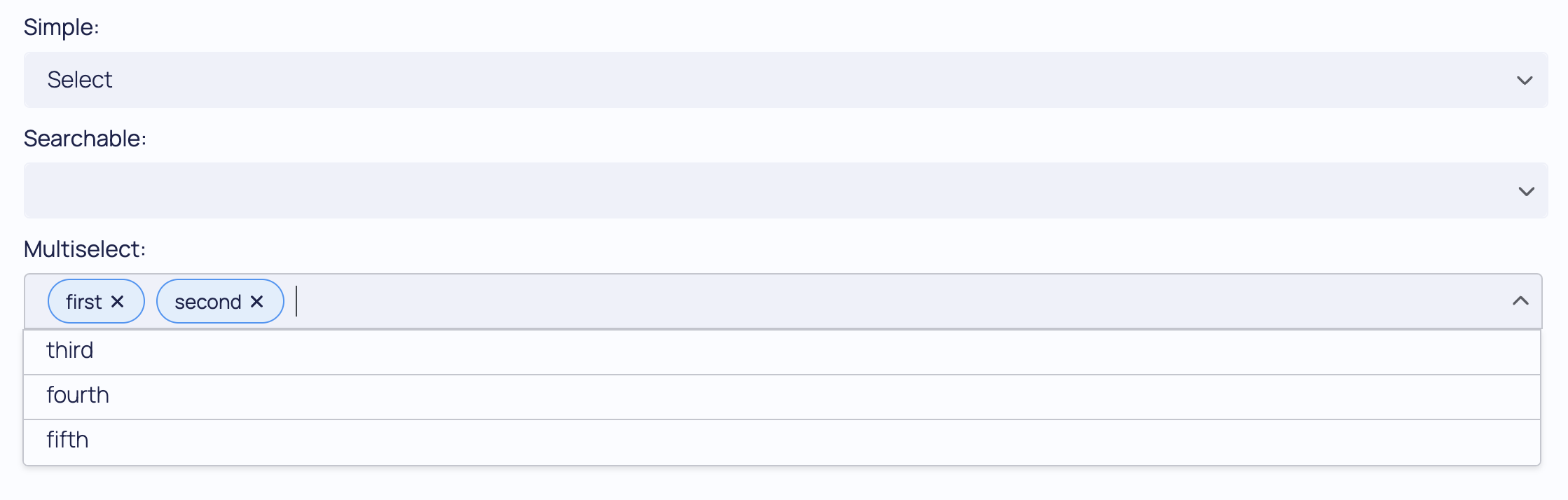
The Select component accepts a value and a set of items to choose from. The items should be a list of strings that or a list of Item instances that define a string label and a value of another type (must be json serializable). If the multiselect option is True then multiple items can be selected at a time, and if the searchable option is True the list of items becomes searchable. The value passed must be a Variable instance and it will be updated with the underlying value when the option is changed.
A Select component is created via:
from dara.core import Variable
from dara.components.common import Select

selection_var = Variable('first')

Select(
    value=selection_var,
    items=['first', 'second', 'third'],
)
A searchable Select component is created via:
from dara.core import Variable
from dara.components.common import Select

selection_var = Variable('first')

Select(
    value=selection_var,
    items=['first', 'second', 'third'],
    searchable=True,
)
A more complicated example with explicit item labels/values that allows multiple items to be selected at the same time:
from dara.core import Variable
from dara.components.common import Select, Item

selection_var = Variable([1, 2])

Select(
    items=[Item(label='first',value=1), Item(label='second',value=2)],
    value=selection_var,
    multiselect=True
)
Example of using a select component to allow selections in a sectioned list:
from dara.core import Variable
from dara.components.common import Select, ListSection

selection_var = Variable()

Select(
    items=[ListSection(label='Section 1', items=['1 item 1', '1 item 2', '1 item 3']), ListSection(label='Section 2', items=['2 item 1', '2 item 2'])],
    searchable=True,
    value=selection_var,
)
Arguments:
id: the key to be used if this component is within a formitems: An array of ListSection, Item or strings that defines the options to rendermax_rows: An optional number of rows to fit in a multiselectmultiselect: Boolean, if True more than one item can be selectedonchange: Action triggered when the select value has changed.placeholder: Placeholder text to be displayed when the select is emptysearchable: Boolean, if True the items can be filtered via a search termvalue: A Variable instance recording the component's state
Attributes
- id: Optional[str]
- multiselect: bool
- searchable: bool
- items: Union[List[Union[Item, ListSection]], NonDataVariable]
- max_rows: int
- onchange: Optional[Action]
- placeholder: Optional[str]
- value: Optional[Union[Variable[Any], UrlVariable[Any]]]