stack
Stack
from dara.components.common.stack import Stack

class Stack(LayoutComponent)
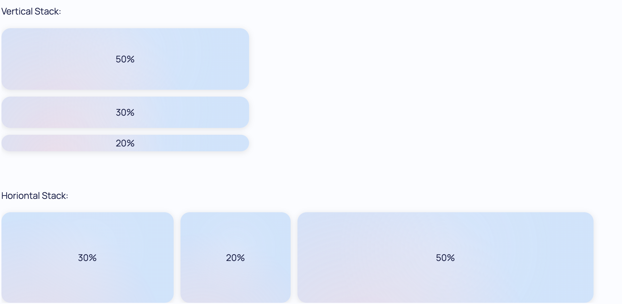
A Stack component is one of the core components for laying out a document. By default a stack takes any number of children as arguments and stacks them underneath each other from first to last. This behavior can be altered to create evenly spaced columns from left to right by adding the direction='horizontal' argument to the constructor.
Stacks can be nested inside one another to create complex layouts that automatically scale correctly to the display size. Stacks will also take into account any child width/height in the layout, e.g. in a 3 column layout, if the first column has a width of 20% then the remaining columns will each get a width of 40% automatically.
Note that by default Stack adds a gap of 0.75rem between child components. When defining the widths and heights inside
of a Stack if the sum is greater than 100% the Stack will overflow. For example if a Stack has two text components each taking
a height of 50%, then the total height is 50% + 50% + 0.75rem, in that case it does overflow. Make sure to take
the gap into account when defining the width/height of your child components. In the example above you could use calc and instead
define the Text heights as calc((100% - 0.75rem) / 2). If you wish to disable this default gap you can add raw_css={'gap': 0} to the component.
A Stack component can be created like so:
from dara.components.common import Stack, Text

Stack(
    Text('One Component'),
    Text('Another Component')
)
By default a Stack will occupy as much space as it can and if multiple Stacks are present they will fill the parent container.
This behavior can be altered by setting the hug argument to True. This will make the Stack hug its contents and only
occupy as much space as it needs. Example of a horizontal Stack that hugs its contents:
from dara.components.common import Stack, Text

Stack(
    Text('One Component'),
    Text('Another Component'),
    direction='horizontal',
    hug=True,
)
You can also set a specific size that the Stack should take if there are certain proportions you want to maintain, in the example below the first Stack will take 30% of the available space, the second Stack will take as much space as its contents need, and the last Stack will take the remaining space:
from dara.components.common import Stack

Stack(
    # first Stack takes 30% of the available space
    Stack(
        ...
        height='30%',
    ),
    # second Stack takes as much space as its contents need
    Stack(
        ...
        hug=True,
    ),
    # last Stack takes the remaining space
    Stack(
        ...
    ),
)
If you would like the contents of a Stack to scroll you can set the scroll argument to True,
However if the Stack has the hug argument set to True then you would need to set the overflow argument to 'auto' instead.
from dara.components.common import Stack, Text

Stack(
    ...,
    Stack(
        ...,  # some content that overflows
        scroll=True,
    ),
    Stack(
        ...,  # some content that should overflow
        hug=True,
        overflow='auto',
    )
)
Important: when using For component with virtualization enabled, do not use the Stack scroll argument,
as it is redundant and will result in unexpected behavior. The For component will automatically handle scrolling
for you.
Arguments:
direction: The direction to stack children, can be 'vertical' or 'horizontal', default is 'vertical'collapsed: Whether to collapse the stackjustify: How to justify the content of the stack, accepts any flexbox justificationsalign: How to align the content of the stack, accepts any flexbox alignmentshug: Whether to hug the content of the stack, defaults to Falsescroll: Whether to scroll the content of the stack, defaults to False
Attributes
- collapsed: Union[Variable[bool], bool]
- direction: Direction
- hug: bool
- scroll: bool