accordion
AccordionItem
from dara.components.common.accordion import AccordionItem

class AccordionItem(BaseModel)
An AccordionItem is designed to be used in the Accordion component. It take a label and optional content to display
An AccordionItem instance is created via:
 from dara.components.common import AccordionItem, Text

AccordionItem(
    content=Text("Some item content"),
    label="Item label"
)
An AccordionItem can include a Badge:
from dara.components.common import AccordionItem, Text, ItemBadge
from dara.core.visual.themes.light import Light


AccordionItem(
    content=Text("Some item content"),
    label="Item label",
    badge=ItemBadge(label='Badge label', color=Light.colors.violet),
)
An AccordionItem can take a component as label:
from dara.components.common import AccordionItem, Text, Stack

AccordionItem(
    content=Text("Some item content"),
    label=Stack(Text("Label in a Component")),
)
Arguments:
badge: An optional BadgeItem to renderlabel: The header label to render, it may be a string or a ComponentInstancecontent: Optional content to render
Attributes
- badge: Optional[ItemBadge]
- label: Union[str, ComponentInstance]
- content: Optional[ComponentInstance]
Accordion
from dara.components.common.accordion import Accordion

class Accordion(LayoutComponent)

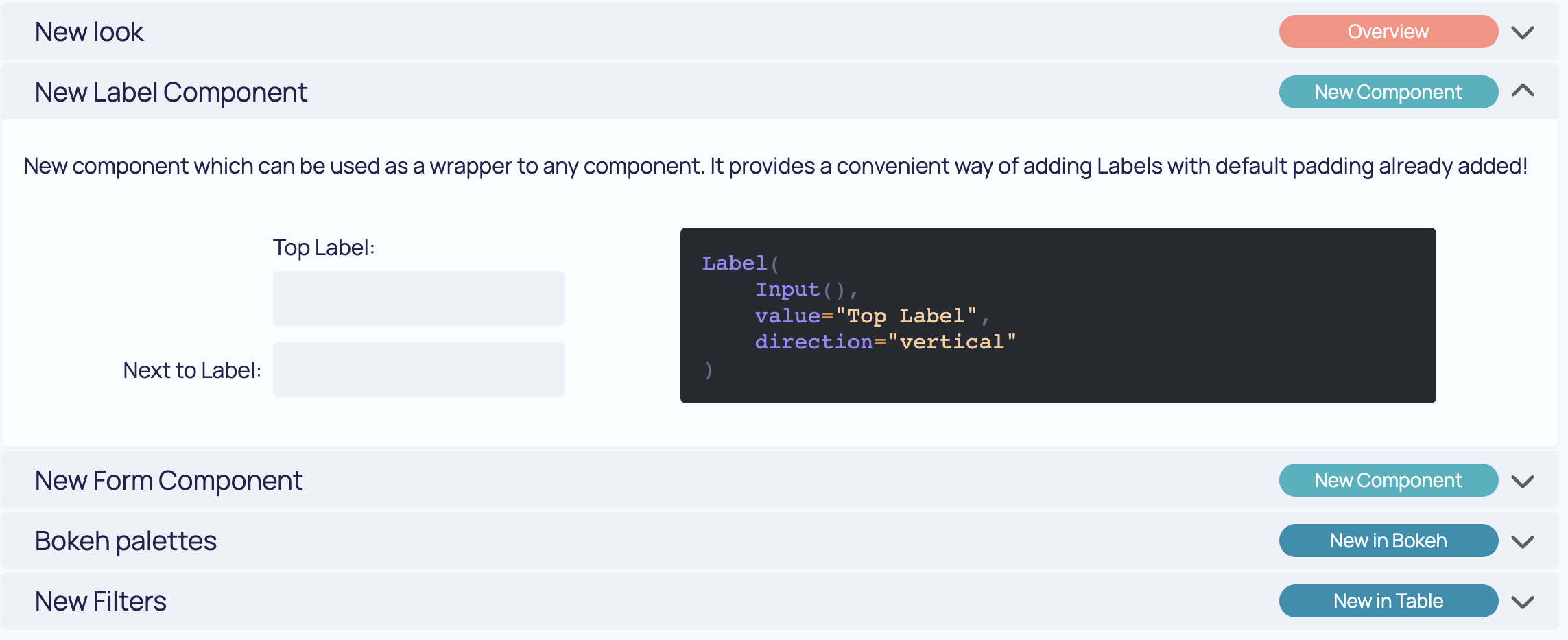
The accordion component displays a vertical list of sections, each containing a label and some content. When a user
clicks on a section label, it expands to show its content. The multi param defines whether multiple sectioned may
appear opened at once. When set to True, all sections opened remain so. When set to False selecting one section
will close the previous selected section.
You can also define a section to be open when the page first renders with the initial param. This takes a number
or a list of numbers corresponding to the position the item to appear opened is in the items array. If you would
like for all sections to start closed you can set it to an empty list.
An Accordion component is created via:
from dara.components.common import Accordion

Accordion(
    items=[AccordionItem(label="First item"), AccordionItem(label="Second item")]
)
An Accordion component with first and third sections initially open:
from dara.components.common import Accordion, AccordionItem

Accordion(
    value=[0,2],
    items=[AccordionItem(label="First item"), AccordionItem(label="Second item"), AccordionItem(label="Third item")]
)
An example of a more complex accordion where a button updates its value:
from dara.components.common import Accordion, AccordionItem, Stack, Button, ItemBadge, Text, ComponentInstance
from dara.core.visual.themes import Light
from dara.core import Variable

acc_var = Variable(1)

 def accordion() -> ComponentInstance:
     return Stack(
         Button('Update component', onclick=acc_var.update(value=0)),
         Accordion(
             items=[
                 AccordionItem(
                     label='First item',
                     content=Text('This is some content'),
                     badge=ItemBadge(label='Label', color=Light.colors.violet),
                 ),
                 AccordionItem(
                     label='Second item',
                     content=Text('This is some content'),
                     badge=ItemBadge(label='Label', color=Light.colors.teal),
                 ),
                 AccordionItem(
                     label='Third item',
                     content=Text('This is some content'),
                     badge=ItemBadge(label='Label', color=Light.colors.orange),
                 ),
             ],
             value=acc_var,
         ),
     )
When a section in an Accordion component is opened, it takes the space that the child needs to render. For some components this can be a problem, for example a Bokeh, Table and CausalGraphs if not otherwise set will render to fill all the available space. This causes a conflict of interests between the Accordion and the child component which can result in weird behavior of component not showing or sliding to fill max height. For these components you can set a height, for example:
from dara.core import get_icon, ConfigurationBuilder, DataVariable
from dara.components.common import ComponentInstance, Table, Accordion, AccordionItem
from dara.components.graphs import CausalGraphViewer
from dara.components.graphs.graph_layout import PlanarLayout

from bokeh.plotting import figure
from dara.components.plotting import Bokeh
from pandas import DataFrame
from cai_causal_graph import CausalGraph

# creates a Bokeh figure
def bokeh_figure() -> Bokeh:
    x = [2, 3, 4, 5, 6, 7, 8]
    y = [12, 14, 15, 18, 20, 22, 26]
    # could not set a sizing_mode, set an absolute size or set it to scale with width as shown below
    fig = figure(sizing_mode='scale_width')
    fig.line(x, y)
    return fig


# creates Table data
table_data = DataVariable(
    DataFrame(
        [
            {
                'col1': 1,
                'col2': 2,
            },
            {
                'col1': 3,
                'col2': 4,
            },
        ]
    )
)

# creates a CausalGraph
def default_causal_graph() -> CausalGraph:
    # defines defaults
    cg = CausalGraph()
    # Adds edges
    cg.add_edge('Summer', 'Shark attacks')
    cg.add_edge('Summer', 'Ice cream sales')
    return cg


def accordion() -> ComponentInstance:
    return Accordion(
        items=[
            AccordionItem(
                label='Bokeh Plot',
                content=Bokeh(bokeh_figure()),
            ),
            AccordionItem(
                label='Table',
                content=Table(columns=['col1', 'col2'], data=table_data, height='160px'),
            ),
            AccordionItem(
                label='Causal Graph',
                content=CausalGraphViewer(
                    causal_graph=default_causal_graph(), graph_layout=PlanarLayout(), height='200px'
                ),
            ),
        ],
        multi=False,
    )


config = ConfigurationBuilder()
config.add_page(name='Accordion Page', content=accordion(), icon=get_icon('chart-line'))
For more examples check the AccordionItem documentation.
:param initial: The initial section(s) of the Accordion that are open, defaults to first item :param items: A AccordionItem list to render, requires at least one item :param multi: Optional that defines whether multiple accordion items may appear open at once. Defaults to True :param value: A list or number containing the index of the sections that are open, or a Variable containing them :param onchange: An action to triggered when the component's state changes
Attributes
- initial: Optional[Union[int, List[int]]]
- value: Optional[Union[Variable[Union[int, List[int]]], UrlVariable[Union[int, List[int]]], int, List[int]]]
- onchange: Optional[Action]
- items: List[AccordionItem]
- multi: Optional[bool]