grid
Column
from dara.components.common.grid import Column

class Column(LayoutComponent)
Column can contains any components similar to Stack. You may align their content as well as defining how many columns it occupies by defining span.
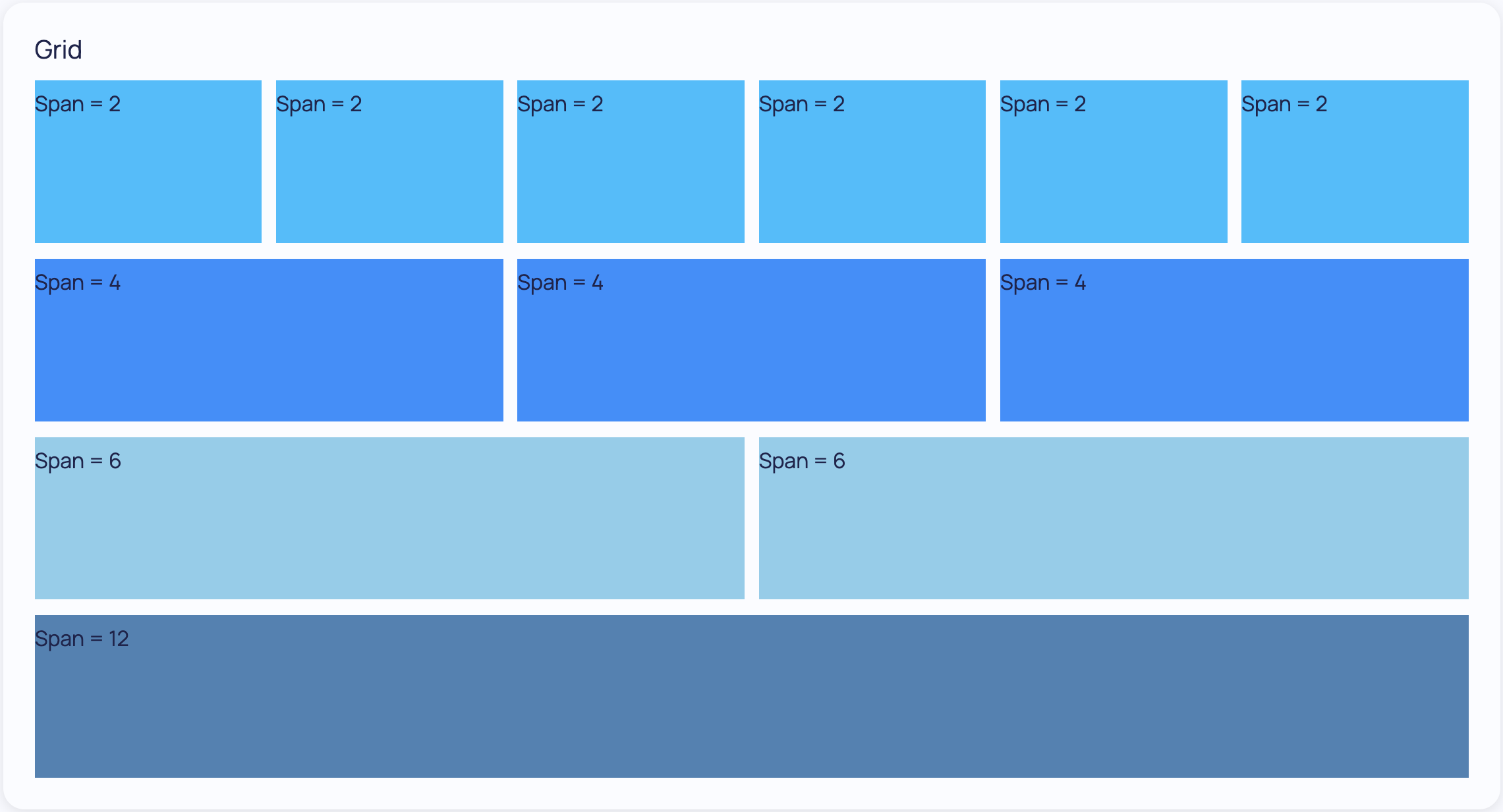
Grid works in a 12 columns per row system. So if you have a column that spans 8 and the next spans 4 they will be added side by side, occupying 67% and 33% of the Grid width respectively. Also note that, given this system, span + offset values should add to no more than 12, doing so may result in unwanted behavior.
Example of simplest Column with alignment:
Grid.Column(Text('Example'), justify='center', align_items='center')
Example of a Column with fixed span and offset:
Grid.Column(Text('Example'), span=3, offset=4)
Example of a Column with span which differs depending on breakpoints:
Grid.Column(Text('Example'), span=Grid.Breakpoints(xs=12, sm=6, md=4, lg=3))
Example of a Column with offset which differs depending on breakpoints:
Grid.Column(Text('Example'), offset=Grid.Breakpoints(xs=6, md=4, lg=3), span=6)
Arguments:
span: the number of columns this column should span, it can take anintegerif unchanged across different screen sizes or takeGrid.Breakpointswhich allows you to define the span across five responsive tiersjustify: How to justify the content of the column, accepts any flexbox justificationsalign: How to align the content of the column, accepts any flexbox alignmentsoffset: offset column by x number of columns, it can take anintegerif unchanged across different screen sizes or takeGrid.Breakpoints. Note that offset + span should add to no more than 12. Values greater that add up to more than 12 can result in unwanted behaviour.direction: The direction to Column children, can be 'vertical' or 'horizontal', default is 'horizontal'hug: Whether to hug the content, defaults to False
Attributes
- span: Optional[Union[int, ScreenBreakpoints]]
- offset: Optional[Union[int, ScreenBreakpoints]]
- direction: Direction
Row
from dara.components.common.grid import Row

class Row(LayoutComponent)
Rows will automatically calculate and wrap columns within it by a 12 column system.
- If columns have an undefined span it will try to fit them equally in a row occupying all space available.
- If columns have a defined span it will respect it and fit wrap other columns into rows such that all rows occupy a maximum of 12 columns.
- It will keep the order of the columns in the row in the order they are defined.
Example of Row with column_gap:
    Grid.Row(
        Grid.Column(Text('Cell 0')),
        Grid.Column(Text('Cell 1')),
        column_gap=2
    )
Arguments:
column_gap: a number containing the desired percentage gap between columns for that row, e.g. 2 would be a 2% gap between columnshug: Whether to hug the content, defaults to Falsejustify: How to justify the content of the row, accepts any flexbox justificationsalign: How to align the content of the row, accepts any flexbox alignments
Attributes
- column_gap: Optional[int]
Grid
from dara.components.common.grid import Grid

@discover
class Grid(LayoutComponent)
Grid Layout provides a flexbox grid with a twelve column system. Rows will automatically calculate their widths and wrap on the page as needed. It also allows for responsive desiness by defining column span breakpoints.
Attributes
- row_gap: str
- breakpoints: Optional[ScreenBreakpoints]
- Column: ClassVar[ColumnType]
- Row: ClassVar[RowType]
- Breakpoints: ClassVar[type[ScreenBreakpoints]]
Methods
__init__
def __init__(*args: Union[ComponentInstance, None], **kwargs)
Grid Layout provides a flexbox grid with a twelve column system.
Rows will automatically calculate their widths and wrap on the page as needed. It also allows for responsive desiness by defining column span breakpoints.
Example of a simple Grid component:
from dara.components.common import Grid, Text

Grid(
    Grid.Row(
        Grid.Column(Text('Cell 0')),
        Grid.Column(Text('Cell 1')),
    ),
    Grid.Row(
        Grid.Column(Text('Cell 2')),
    ),
)
Example of a Grid with fixed span and undefined span columns:
Note how you can let the Row wrap itself into different rows with undefined span columns filling all available space:
from dara.components.common import Grid, Text

Grid(
    Grid.Row(
        Grid.Column(Text('Span = 2'), span=2, background='orange'),
        Grid.Column(Text('Undefined'), background='cornflowerblue'),
        Grid.Column(Text('Span = 6'), span=6, background='coral'),
        Grid.Column(Text('Span = 5'), span=5, background='crimson'),
        Grid.Column(Text('Undefined'), background='darkmagenta'),
        Grid.Column(Text('Undefined'), background='gold'),
        Grid.Column(Text('Span = 6'), span=12, background='lightseagreen'),
    ),
)
Example of a Responsive Grid:
Here we define how much each column spans foe each screen size type. For xs screens each column spans the whole 12 columns available.
For larger and larger screens we allow these to come side by side. For sm you have two columns per row, md three columns and finally lg or bigger screens you can have all four columns side by side.
Here we also show column_gap which is a Row property allowing you to define some spacing between columns, and row_gap a Grid property to define spacing between rows.
from dara.components.common import Grid, Text

span_layout = Grid.Breakpoints(xs=12, sm=6, md=4, lg=3)

Grid(
    Grid.Row(
        Grid.Column(Text('Red'), span=span_layout, background='red'),
        Grid.Column(Text('Green'), span=span_layout, background='green'),
        Grid.Column(Text('Blue'), span=span_layout, background='blue'),
        Grid.Column(Text('Yellow'), span=span_layout, background='yellow'),
        column_gap=2,
    ),
    row_gap='10px',
)
Example of a Custom Breakpoints:
You can also custom define where one or all of the breakpoints happen, This uses the same Grid.Breakpoints helper, but now instead of defining the span of each column we define in pixels each breakpoint.
from dara.components.common import Grid, Text

custom_breakpoints = Grid.Breakpoints(xs=0, sm=500, md=600, lg=700, xl=800)

Grid(
    Grid.Row(
        Grid.Column(Text('Red'), span= Grid.Breakpoints(xs=12, sm=6, md=4, lg=3), background='red'),
        Grid.Column(Text('Blue'), span= 4, background='blue'),
    ),
    breakpoints=custom_breakpoints,
)
Example of a Grid component which only occupies as much space as it needs with the hug property:
from dara.components.common import Grid, Text

Grid(
    Grid.Row(
        Grid.Column(Text('Cell 0')),
        Grid.Column(Text('Cell 1')),
    ),
    Grid.Row(
        Grid.Column(Text('Cell 2')),
    ),
    hug=True,
)
In the example above each row will only occupy as much space as it needs, that will be the space the text takes. This can be overwritten at a row level. For example, you could set a specific value for a row height, or even set grow to True/hug to False to allow only one row to grow and the others occupy only the space needed.
Arguments:
row_gap: a string containing the desired gap between rows, defaults to 0.75rembreakpoints: optionally pass when the breakpoints should occur in pixelsjustify: How to justify the content of the grid, accepts any flexbox justificationsalign: How to align the content of the grid, accepts any flexbox alignments