checkbox_group
CheckboxGroup
from dara.components.common.checkbox_group import CheckboxGroup

class CheckboxGroup(FormComponent)
CheckboxGroup component accepts a list of selectable items and allows the user to select them.
It displays a list of checkboxes. It is possible to set how many checkboxes may be selected
at a given time with the select_max param. Otherwise all of them may be selected.
Simple CheckboxGroup component:
from dara.core import Variable
from dara.components import CheckboxGroup


CheckboxGroup(
    items=['first', 'second', 'third', 'fourth', 'fifth'],
    value=Variable(['second', 'fifth']),
)
CheckboxGroup with items with custom labels and values:
from dara.core import Variable
from dara.components import CheckboxGroup, Item

CheckboxGroup(
    items=[Item(label='first',value=1), Item(label='second',value=2)],
    value=Variable([1]),
)
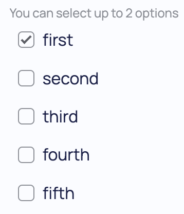
CheckboxGroup component with at most two values selectable at a time:
from dara.core import Variable
from dara.components import CheckboxGroup

CheckboxGroup(
    items=['first', 'second', 'third', 'fourth', 'fifth'],
    value=Variable(),
    select_max=2,
)
CheckboxGroup component where at least two values need to be selected for var and var_to_update to be updated.
from dara.core import Variable
from dara.components.common import CheckboxGroup

var = Variable()

CheckboxGroup(
    items=['first', 'second', 'third', 'fourth', 'fifth'],
    value=var,
    select_min=2,
    list_styling=True,
)
Arguments:
items: An Item list that defines labels to render and values to receive from CheckboxGroupselect_max: The maximum number of items that can be selected at a time, the component blocks the user from making any selections above this number.select_min: The minimum number of items that can be selected at a time, if less items than the selected number are selected no action is triggered by the onchange, and variable values are not updated.list_styling: If set to True, the component shows a list style version of checkboxes where the background is highlighted instead of the checkboxes themselves.value: A Variable instance recording the component's initial and subsequent stateonchange: Action triggered when the selected value has changedid: the key to be used if this component is within a form
Attributes
- items: Union[List[Item], NonDataVariable]
- select_max: Optional[int]
- select_min: Optional[int]
- list_styling: bool
- value: Optional[Union[Variable[Any], UrlVariable[Any]]]
- onchange: Optional[Action]
- id: Optional[str]