tabbed_card
TabbedCard
from dara.components.common.tabbed_card import TabbedCard

class TabbedCard(LayoutComponent)
A tabbed card wraps a series of tab instances and optionally takes which tab will initially be displayed
A tabbed card component can be created via:
from dara.components.common import Tab, TabbedCard, Text
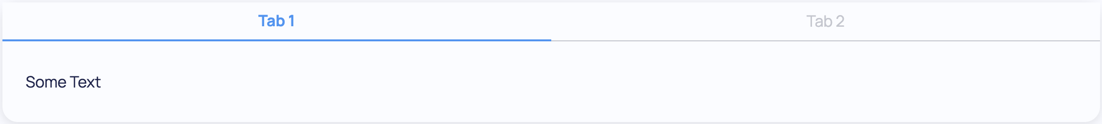
TabbedCard(
Tab(
Text('Some Text'),
title='Tab 1'
),
Tab(
Text('Some Text'),
title='Tab 2'
)
)
A tabbed card component where the tab is controlled by a Variable:
from dara.core import Variable
from dara.components.common import Tab, TabbedCard, Text

tab_var = Variable('Tab 2')

TabbedCard(
    Tab(Text('Some Text'), title='Tab 1'),
    Tab(Text('Some Text'), title='Tab 2'),
    selected_tab=tab_var,
)
Arguments:
initial_tab: Optional title of the tab to initially render, defaults to the firstselected_tab: Optional selected tab mapped to a variable so that the selected tab can be easily accessed
Attributes
- initial_tab: Optional[str]
- selected_tab: Optional[NonDataVariable]
Tab
from dara.components.common.tabbed_card import Tab

class Tab(LayoutComponent)
A tab takes a title, subtitle and its child must be a component instance to display
A Tab component can be created via:
from dara.components.common import Tab, Text

Tab(
   Text('Some text'),
   title='A Title'
)
:param title: The title of the tab
Attributes
- title: str