button
Button
from dara.components.common.button import Button

@discover
class Button(LayoutComponent)
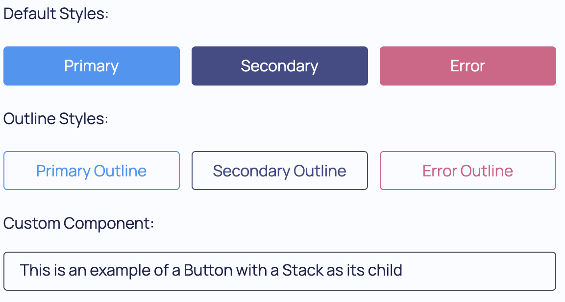
A Button component. It accepts text or any component as content and has additional options for adding icons. If a string or Text component are the child of button then it defaults to 'primary' styling, otherwise it defaults to 'plain' styling.
To control what happens when a button is clicked you can pass an Action to the onclick parameter.
A button component with an icon and styling:
from dara.core import action
from dara.components import Button, ButtonStyle

@action
async def navigate_to(ctx: action.Ctx, url: str):
    await ctx.navigate(url)

Button(
    'Click',
    onclick=navigate_to('/test'),
    icon='Pen',
    styling=ButtonStyle.SECONDARY,
    outline=True,
)
The different button styles supported are: 'error', 'ghost', 'plain', 'primary' and 'secondary'. Other styling option is to choose whether to show the outline or filled version with the outline property. This defaults to False.
A button component that is disabled but can be enabled by updating the variable disabling it:
from dara.core import Variable, action
from dara.components import Button

disabled = Variable(True)

@action
async def navigate_to(ctx: action.Ctx, url: str):
    await ctx.navigate(url)

Button(
    'Click',
    disabled=disabled,
    onclick=navigate_to('/test'),
)
A button component can also take any component inside of it to make it into some clickable component. For example a button with a Stack and some Text inside of it would look like:
from dara.core import action
from dara.components import Button, Stack, Text

@action
async def navigate_to(ctx: action.Ctx, url: str):
    await ctx.navigate(url)

Button(
    Stack(
        Text(
            'Stack passed to button, when clicked I navigate to test page',
        ),
    ),
    onclick=navigate_to('/test'),
)
Arguments:
disabled: A variable, condition, or bool to disabled the button when trueonclick: An Action that is triggered by clicking the buttonicon: An optional icon to display, see dara.core.css.get_icon for detailsstyling: A style of the button, can be 'primary', 'secondary', 'error', 'plain' or 'ghost'outline: This allows to pick between two styles, if False the button is filled with a solid background color, if True it shows a transparent background with an outlined colored border. Filled buttons are more prominent and often used as primary actions, while outline buttons are more subtle and commonly used as secondary actions.
Attributes
- disabled: Optional[Union[Condition, NonDataVariable, bool]]
- onclick: Optional[Action]
- icon: Optional[str]
- styling: Optional[ButtonStyle]
- outline: bool