carousel
Carousel
from dara.components.common.carousel import Carousel

class Carousel(ContentComponent)
The carousel component takes a list of CarouselItems and displays them in a standard carousel format. The items should be a list of CarouselItems instances. The Carousel component is able to showcase text, images or any other component.
A simple Carousel with text only can be created via:
from dara.components.common import Carousel, CarouselItem

Carousel(
    items=[
        CarouselItem(title='Title', subtitle='This is some text description'),
        CarouselItem(title='Another Title', subtitle='This is some text description'),
    ]
),
A Carousel may also have images:
from dara.components.common import Carousel, CarouselItem

Carousel(
    items=[
        CarouselItem(
            image='https://moderncat.com/wp-content/uploads/2021/01/bigstock-Domestic-Cat-Beautiful-Old-Ca-353858042.png'
        ),
        CarouselItem(
            image='https://www.preventivevet.com/hs-fs/hubfs/pug%20treats.jpg?width=600&height=300&name=pug%20treats.jpg'
        ),
    ]
),
Example of a complex Carousel which contains text, image and components:
from dara.components.common import Carousel, CarouselItem, Button, Slider, Label
Carousel(
items=[
CarouselItem(
title='Cat',
subtitle='Image of a cat staring into oblivion',
image='https://moderncat.com/wp-content/uploads/2021/01/bigstock-Domestic-Cat-Beautiful-Old-Ca-353858042.png',
image_width='50%',
image_alt='Cat looking up',
component=Button('Component Example'),
),
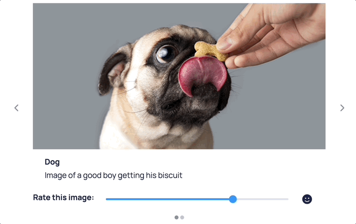
CarouselItem(
title='Dog',
subtitle='Image of a good boy getting his biscuit',
image='https://www.preventivevet.com/hs-fs/hubfs/pug%20treats.jpg?width=600&height=300&name=pug%20treats.jpg',
component=Label(
Slider(domain=[0, 10], disable_input_alternative=True),
value='Rate this image:',
direction='horizontal',
bold=True,
),
),
]
),
Do note that when passing images in the component of the CarouselItem, the image can cause the Carousel to change height as you scroll through the items. The Carousel automatically resizes to the height of the largest item. However if the image has not been rendered yet, the Carousel will not initially know the height of the image and can result in weird behavior. To avoid this, you can set an image height if passing it as part of the CarouselItem component prop.
A Carousel can also be controlled by Variables, in the example below it will first render showing the second panel:
from dara.core import Variable
from dara.components.common import Carousel, CarouselItem

Carousel(
    items=[
        CarouselItem(title='First', subtitle='This is panel 0'),
        CarouselItem(title='Second', subtitle='This is panel 1'),
        CarouselItem(title='Third', subtitle='This is panel 2'),
    ]
    value=Variable(1)
),
Arguments:
items: An CarouselItem list for the carousel to rendervalue: The value of the Carousel, this takes the index of the panel it should showonchange: Action triggered when the component changes states
Attributes
- items: Union[List[CarouselItem], NonDataVariable]
- value: Optional[Union[Variable[int], UrlVariable[int]]]
- onchange: Optional[Action]